Mindly
Mindly App
Overview: This is a project I did as part of my Master's Degree at Universidad Politécnica de Madrid. The goal was to create an exciting idea for any market we would like and develop a high-fidelity prototype of the application, and after that get users' feedback through different UX Research methods.
Role: UX Design, UX Research, Visual Design
Team: 4 HCID Master Students (🇲🇽🇪🇸🇧🇬)
Tool Kits: Figma
Users: Young people who want to go to therapy
Timeline: August 2023 - January 2024
Outcome: Achieved a high-fidelity prototype ✨
1. Project Summary
2. Iterative Creative Process
2.1. User Journey Map 2.2. Moodboard 2.3. Storyboard
3. High-Fidelity Prototype
4. Components used
5. Figma Demo
6. Feedback Results
6.1. Five-Seconds Test 6.2. UEQ
1. Project Summary
Problem Identified
People who have never been to therapy are not sure where to start, and whenever you are dealing with your mental health it is very overwhelming to have to ask around for information and try to find the right therapist for you by trial and error of having to go to different therapists and repeat the long process several times.
Solution: Mindly
Mindly is a mobile app where users can find therapists tailored to their needs. You can easily switch between therapists if you're not satisfied, and after sessions, you can track your mood and get personalized activity suggestions to feel better, which your therapist can discuss with you later.
Iterative Creative Process
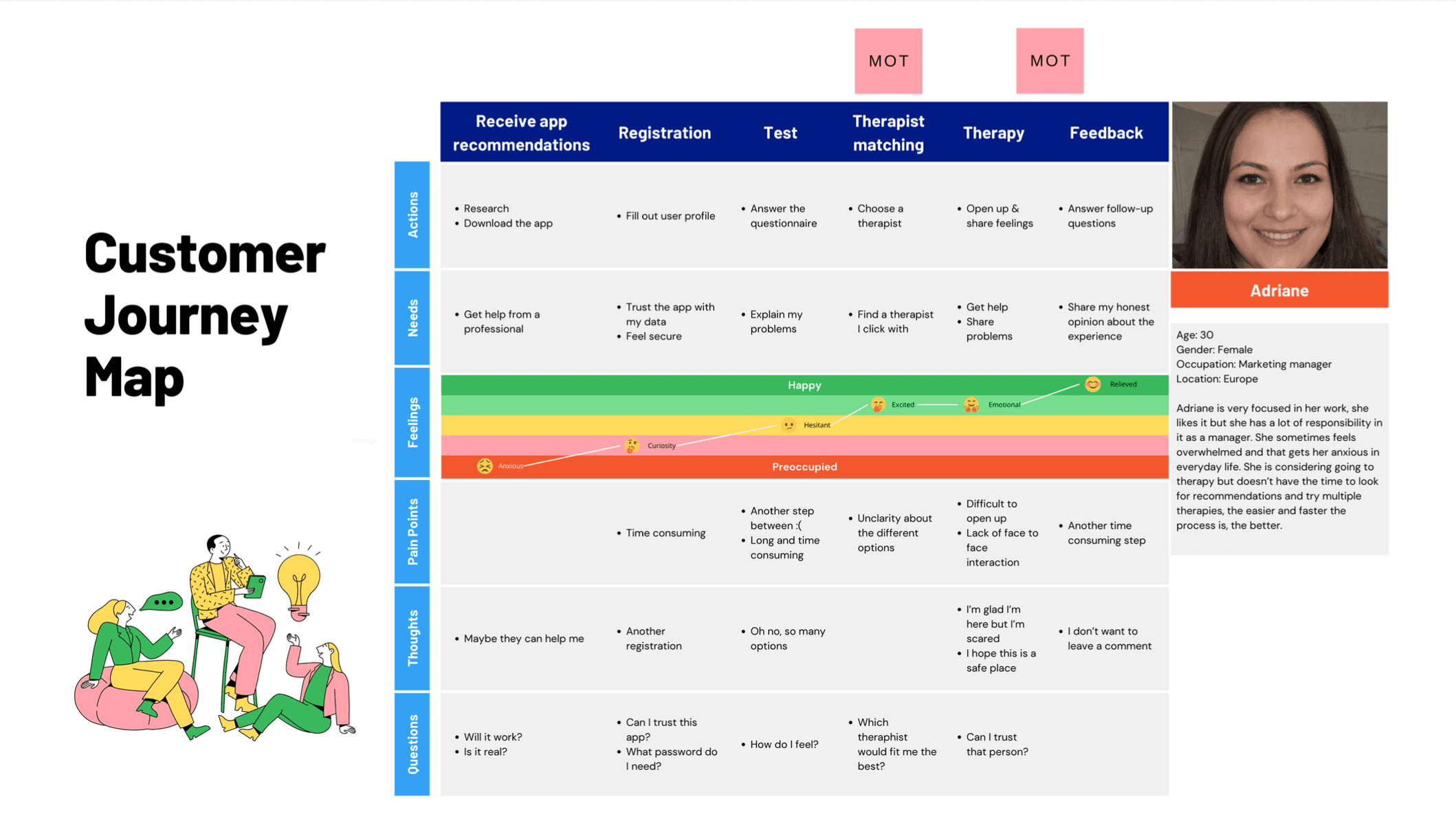
2.1. User Journey Map
This is a representation of the most interesting information for our app to be able to visualize the user experience throughout the interaction with the system, developing a potential user persona and identifying the important moments (MOT) in the app where the experience needs to satisfy the user.
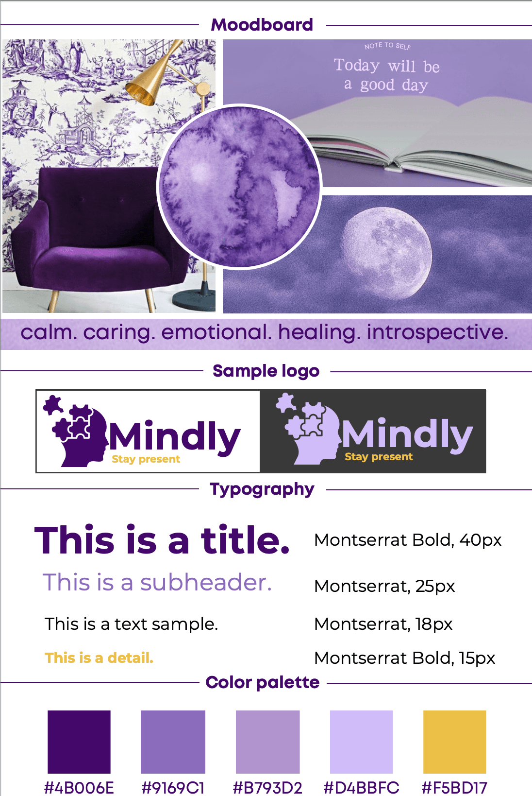
2.2. Moodboard
Phase 1: We decided to do different mood boards to decide the personality, color palette and general feel for the app, the next images are in order of iteration from the creative process.
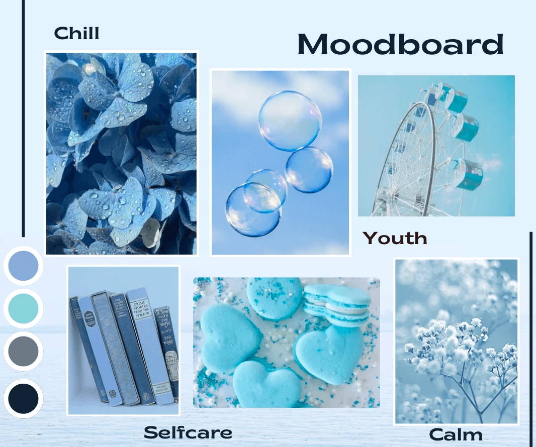
Phase 2: Decided the color blue could be associated with hospitals and health and that was not the goal for Mindly.
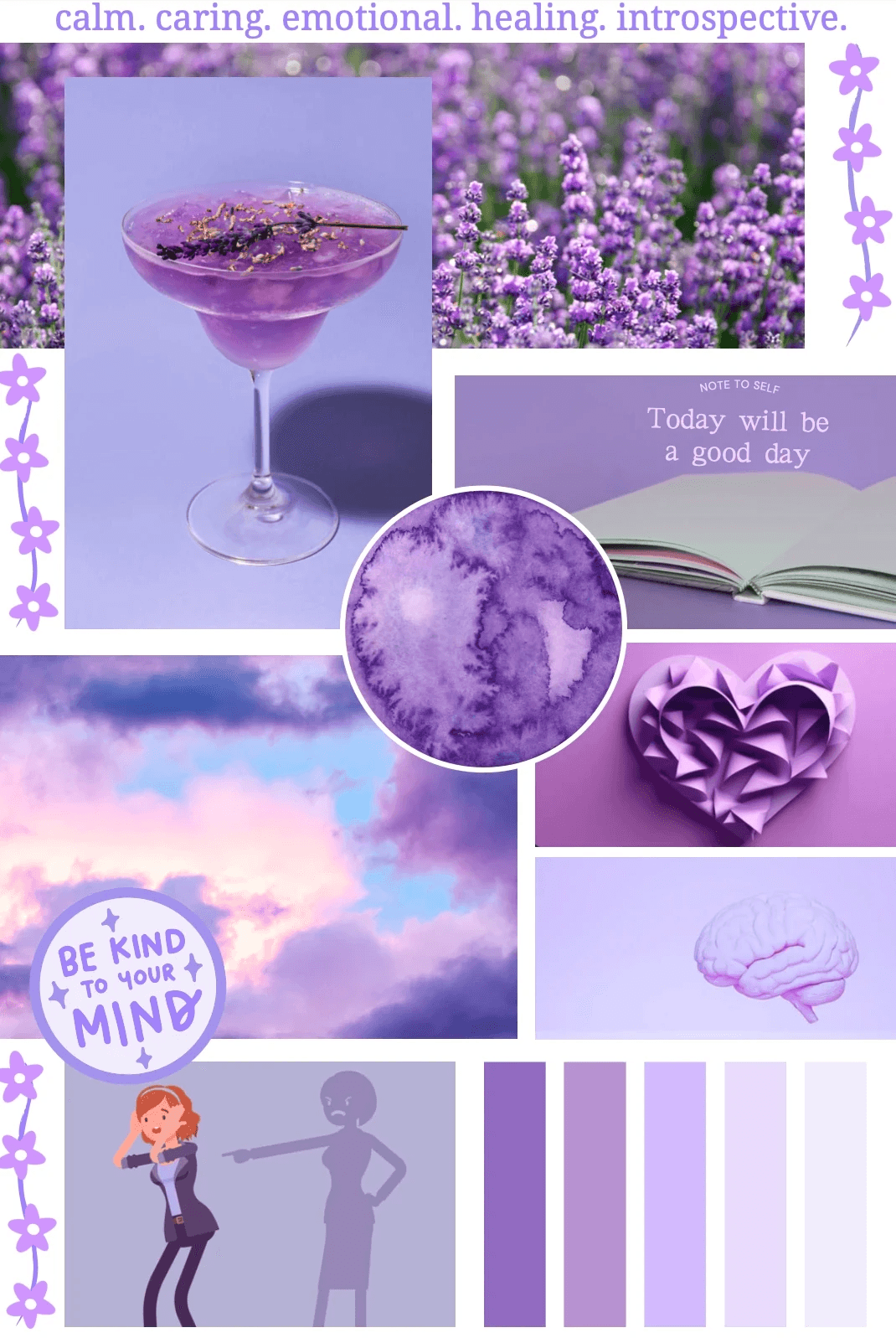
Phase 3: felt like the right direction for Mindly, but too "girly" and the goal was shifted to look more elegant.

Final Moodboard
2.3. Storyboard
After a creative one-week sprint where each of the team members had to come up with 8 ideas (Crazy 8's) for the user experience that could be implemented in the app, we chose our favorites to think them through.
We came up with some features, one of them adsressing the moment of meeting the therapist, two related to the mood tracker feature and the last one was a gamification feature, where the system rewards you if you achieve some milestones and have good habits.
We decided to implement the reward system and the mood tracker. The main reason is they enhance the main purpose of the application, since they contribute to the core features of the application.
The storyboard is a result of the natural process of the application with the added features. Both of them fit well and can be integrated in the process.

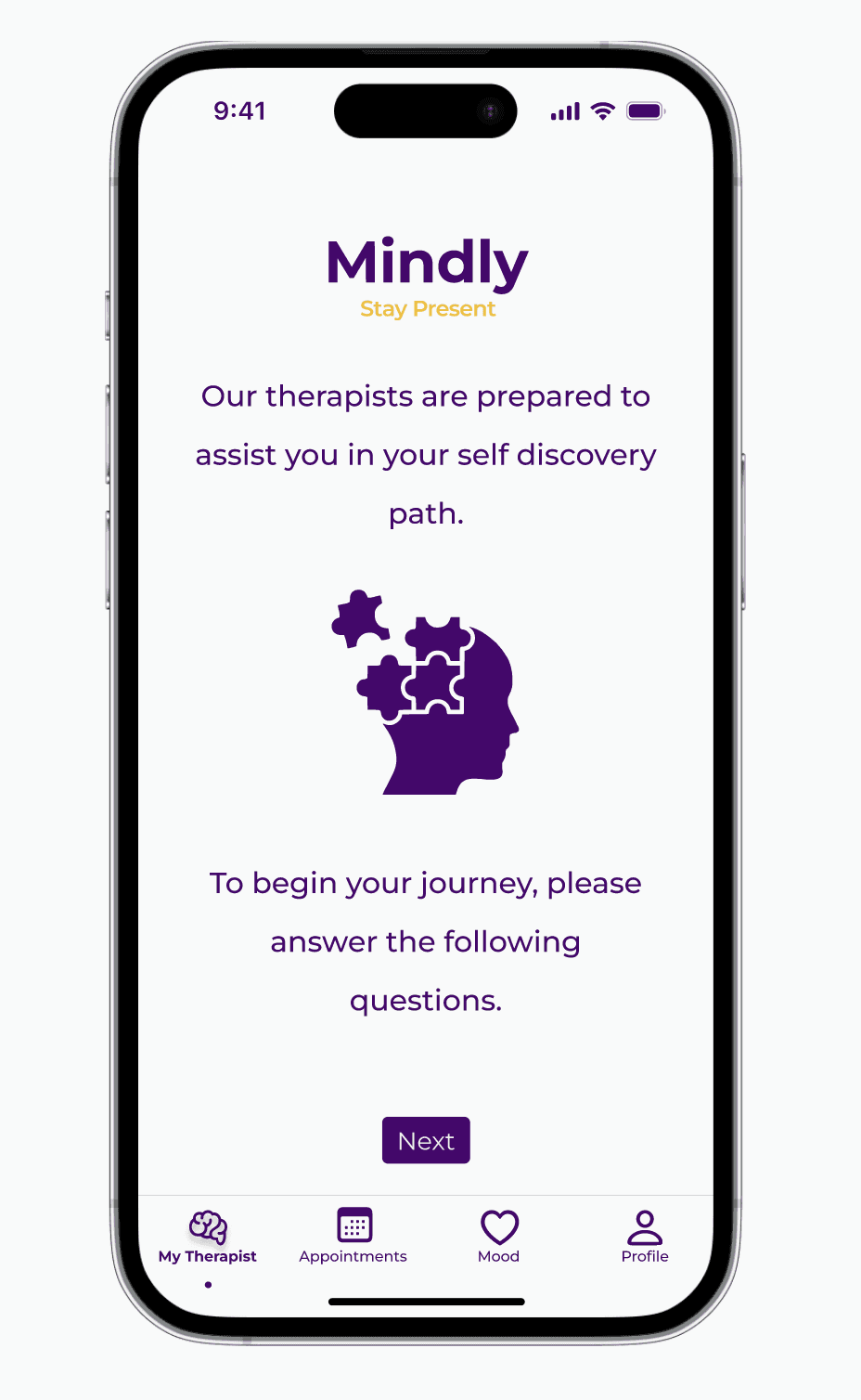
3. High-Fidelity Prototype
Because of the time-frame given to elaborate the prototype we decided to make the flow for only 2 different tasks.
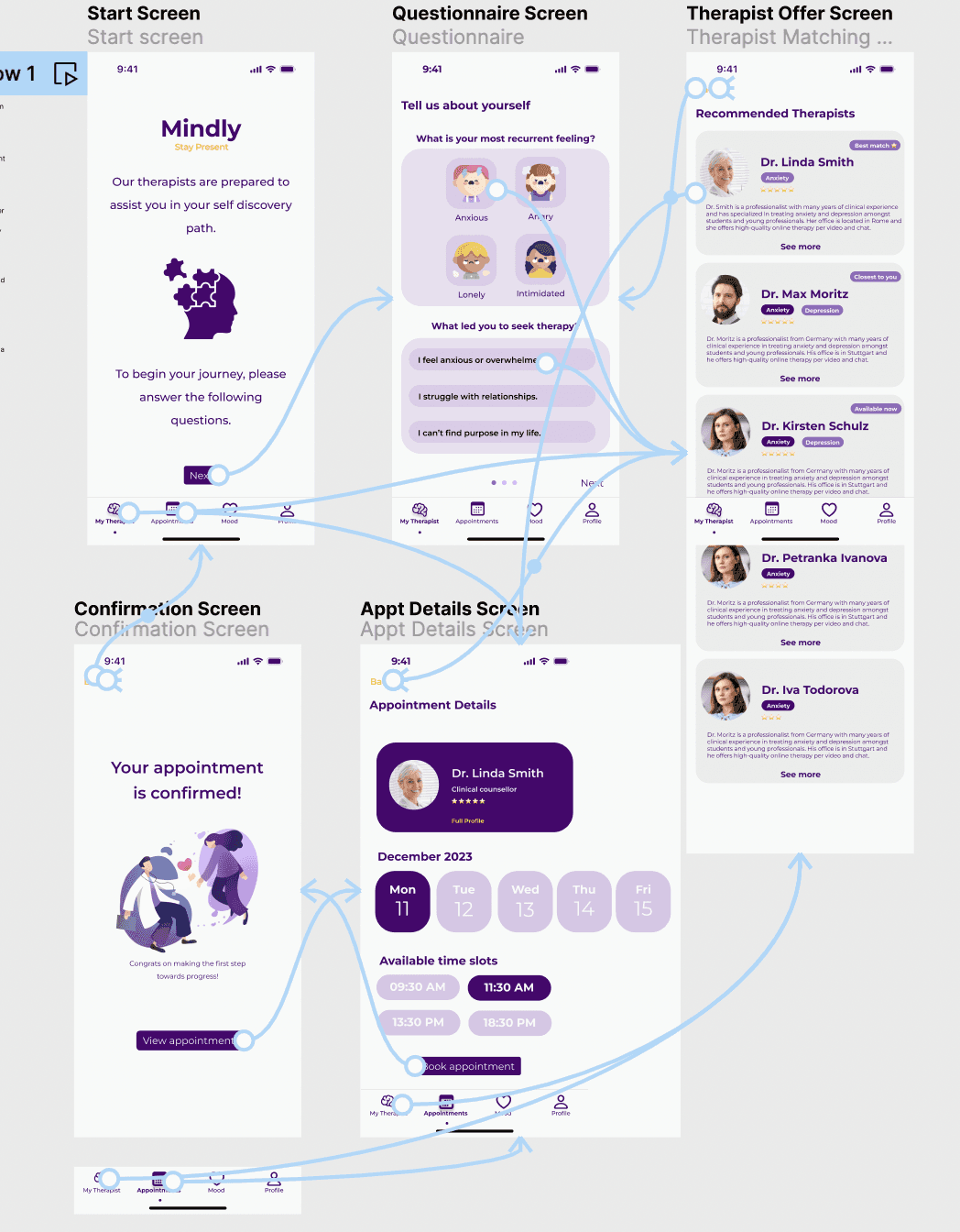
Task 1: Find a therapist and book an appointment
Description: The goal of the task is to gather more information about the user’s current mental state through an initial questionnaire, offer therapists that could best help handle his problem and help him book an appointment with a chosen therapist for a convenient date and time.
Context: The user is feeling very anxious and overwhelmed and wants to seek out a therapist who can help him manage those emotions. He wants to be sure that he finds the best one for his needs and wants to talk with him on the following day (Dec11).
Steps: Fill out the initial questionnaire, get personalized therapist suggestions, choose a therapist, choose date & time for an appointment, book the appointment
End: The end goal is to see a screen confirming the appointment with the user’s chosen therapist.
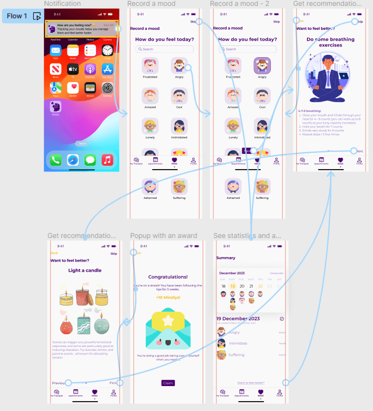
Task 2: Track your mood
Start: You received a notification that you can track your mood
Context: The user is feeling angry and after getting a prompt from the app he wants to record his mood, make improvements and see his statistics.
Steps: Open your app through the notification; Select how you are feeling, Get recommendations on how to feel better; Claim the reward after completing the mindfulness exercise
End: See a calendar with all of your tracked moods this week
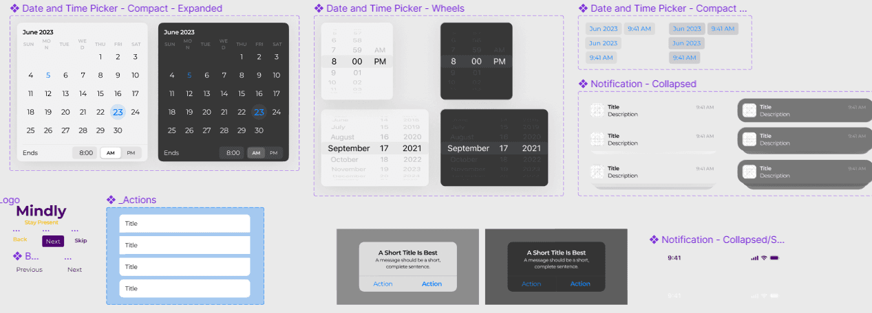
4. Components used
5. Demo
Feedback Results from Users
6.1. Five-Seconds Test
To evaluate if our design was proficient and understandable for users, we did a five-second test in Lyssna to students at UPM.
The goal of this test was to evaluate if we complied with the following objectives in the Mindly design:
1.Verify whether our chosen color palette transmits the emotions we hoped for.
2.Learn if the app’s purpose is clear to the user.
3.Learn what our users focus on first in the MOT.
Questions asked:
What service is offered by the app?
What is the difference between the therapists?
What was the most prominent emotion you felt just by looking at the color scheme?
What element stood out the most for you visually?
Try the test here! -> https://app.lyssna.com/do/b159db92bdf9/92ae
The findings are the following:
The users have the expected emotions for the color palette. ✅
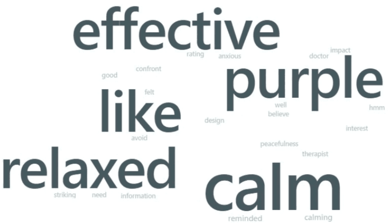
The users have the right idea about what Mindly offers. ✅

In the MOT screen of the list of therapists, users had some recommendations for the design, here are some possible solutions that could be implemented:
Too much information -> Less information could be displayed at first, have just the name and specialty of the doctor and have the information displayed in a card when you click "See more".
Consider location. -> A lot of the users thought that instead of the therapist list being sorted by "Best match" it was sorted by location, so to comply with what the users are used to it could be a better idea to sort them by location too.
Difficult to understand differences. ->. Highlight better differences between therapists' specializations.
Results: https://app.lyssna.com/tests/b159db92bdf9/results/fca821a0c8af
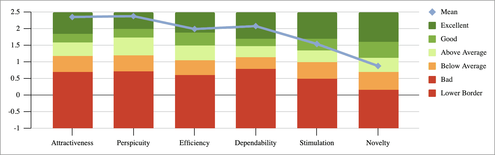
6.2. UEQ
The User Experience Questionnaire is a data analysis tool that analyzes "The scales of the questionnaire cover a comprehensive impression of user experience."(UEQ, n.d.).
The questionnaire was done with data from 26 interviews after doing the tasks previously mentioned. All interviews were done in English.
Check out the complete results here. ->. https://docs.google.com/spreadsheets/d/15cC2q4Wv9QBfqjf54Q1ZYNVgw8Lw25wE/edit?usp=sharing&ouid=117454455245460015046&rtpof=true&sd=true
The users were happy with the result and it was shown in the following graph:
Mindly
Mindly App
Overview: This is a project I did as part of my Master's Degree at Universidad Politécnica de Madrid. The goal was to create an exciting idea for any market we would like and develop a high-fidelity prototype of the application, and after that get users' feedback through different UX Research methods.
Role: UX Design, UX Research, Visual Design
Team: 4 HCID Master Students (🇲🇽🇪🇸🇧🇬)
Tool Kits: Figma
Users: Young people who want to go to therapy
Timeline: August 2023 - January 2024
Outcome: Achieved a high-fidelity prototype ✨
1. Project Summary
2. Iterative Creative Process
2.1. User Journey Map 2.2. Moodboard 2.3. Storyboard
3. High-Fidelity Prototype
4. Components used
5. Figma Demo
6. Feedback Results
6.1. Five-Seconds Test 6.2. UEQ
1. Project Summary
Problem Identified
People who have never been to therapy are not sure where to start, and whenever you are dealing with your mental health it is very overwhelming to have to ask around for information and try to find the right therapist for you by trial and error of having to go to different therapists and repeat the long process several times.
Solution: Mindly
Mindly is a mobile app where users can find therapists tailored to their needs. You can easily switch between therapists if you're not satisfied, and after sessions, you can track your mood and get personalized activity suggestions to feel better, which your therapist can discuss with you later.
Iterative Creative Process
2.1. User Journey Map
This is a representation of the most interesting information for our app to be able to visualize the user experience throughout the interaction with the system, developing a potential user persona and identifying the important moments (MOT) in the app where the experience needs to satisfy the user.
2.2. Moodboard
Phase 1: We decided to do different mood boards to decide the personality, color palette and general feel for the app, the next images are in order of iteration from the creative process.
Phase 2: Decided the color blue could be associated with hospitals and health and that was not the goal for Mindly.
Phase 3: felt like the right direction for Mindly, but too "girly" and the goal was shifted to look more elegant.
Final Moodboard
2.3. Storyboard
After a creative one-week sprint where each of the team members had to come up with 8 ideas (Crazy 8's) for the user experience that could be implemented in the app, we chose our favorites to think them through.
We came up with some features, one of them adsressing the moment of meeting the therapist, two related to the mood tracker feature and the last one was a gamification feature, where the system rewards you if you achieve some milestones and have good habits.
We decided to implement the reward system and the mood tracker. The main reason is they enhance the main purpose of the application, since they contribute to the core features of the application.
The storyboard is a result of the natural process of the application with the added features. Both of them fit well and can be integrated in the process.
3. High-Fidelity Prototype
Because of the time-frame given to elaborate the prototype we decided to make the flow for only 2 different tasks.
Task 1: Find a therapist and book an appointment
Description: The goal of the task is to gather more information about the user’s current mental state through an initial questionnaire, offer therapists that could best help handle his problem and help him book an appointment with a chosen therapist for a convenient date and time.
Context: The user is feeling very anxious and overwhelmed and wants to seek out a therapist who can help him manage those emotions. He wants to be sure that he finds the best one for his needs and wants to talk with him on the following day (Dec11).
Steps: Fill out the initial questionnaire, get personalized therapist suggestions, choose a therapist, choose date & time for an appointment, book the appointment
End: The end goal is to see a screen confirming the appointment with the user’s chosen therapist.
Task 2: Track your mood
Start: You received a notification that you can track your mood
Context: The user is feeling angry and after getting a prompt from the app he wants to record his mood, make improvements and see his statistics.
Steps: Open your app through the notification; Select how you are feeling, Get recommendations on how to feel better; Claim the reward after completing the mindfulness exercise
End: See a calendar with all of your tracked moods this week
4. Components used
5. Demo
Feedback Results from Users
6.1. Five-Seconds Test
To evaluate if our design was proficient and understandable for users, we did a five-second test in Lyssna to students at UPM.
The goal of this test was to evaluate if we complied with the following objectives in the Mindly design:
1.Verify whether our chosen color palette transmits the emotions we hoped for.
2.Learn if the app’s purpose is clear to the user.
3.Learn what our users focus on first in the MOT.
Questions asked:
What service is offered by the app?
What is the difference between the therapists?
What was the most prominent emotion you felt just by looking at the color scheme?
What element stood out the most for you visually?
Try the test here! -> https://app.lyssna.com/do/b159db92bdf9/92ae
The findings are the following:
The users have the expected emotions for the color palette. ✅
The users have the right idea about what Mindly offers. ✅
In the MOT screen of the list of therapists, users had some recommendations for the design, here are some possible solutions that could be implemented:
Too much information -> Less information could be displayed at first, have just the name and specialty of the doctor and have the information displayed in a card when you click "See more".
Consider location. -> A lot of the users thought that instead of the therapist list being sorted by "Best match" it was sorted by location, so to comply with what the users are used to it could be a better idea to sort them by location too.
Difficult to understand differences. ->. Highlight better differences between therapists' specializations.
Results: https://app.lyssna.com/tests/b159db92bdf9/results/fca821a0c8af
6.2. UEQ
The User Experience Questionnaire is a data analysis tool that analyzes "The scales of the questionnaire cover a comprehensive impression of user experience."(UEQ, n.d.).
The questionnaire was done with data from 26 interviews after doing the tasks previously mentioned. All interviews were done in English.
Check out the complete results here. ->. https://docs.google.com/spreadsheets/d/15cC2q4Wv9QBfqjf54Q1ZYNVgw8Lw25wE/edit?usp=sharing&ouid=117454455245460015046&rtpof=true&sd=true
The users were happy with the result and it was shown in the following graph: