Leisure time app

Project Summary
Overview: This is a case study I did as a part of my Master's Degree at Universidad Politécnica de Madrid.
Role: UX Design, UX Research
Team: 4 HCID Master Students (🇲🇽🇪🇸🇮🇹🇩🇪)
Tool Kits: Miro, Balsamiq
Users: University International Students in Madrid.
Timeline: 4 Months. August 2023 - January 2024
Outcome: Achieved a low-fi prototype from a user centered design research.
1. Project Summary
2. User Centered Design Process
3. Interviews Planning and Formulation
3.1. Personas Creation 3.2.Quantitative and Qualitative Analysis
4. Validity of Results
5. Designing the UI
5.1. Planning (Navigation Map,Scheme Layouts, Sketches)
5.2. Before Prototyping (Task Flow, Wireflow, User Flow)
6. Low-Fidelity Prototype
6.1 Paper Prototype. 6.2. Balsamiq Prototype
2. User Centered Design Process
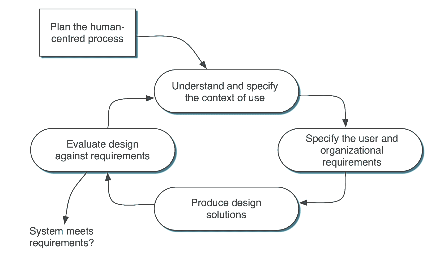
Source: ISO Standard 9241-11
3. Interviews Planning and Formulation
To get to know what the users wanted, we needed to understand the context of use, environment and the users that would be our target. After doing interviews with 10 international students, we found out that even though they are similar the goals they are looking for in their leisure time varies.
Conclusion: Their context of use is similar as their main similarity is that they are foreigners studying in Madrid, they each want to experience Madrid in different ways depending on their interests and seek ways to fulfill their own expectations from their new home.
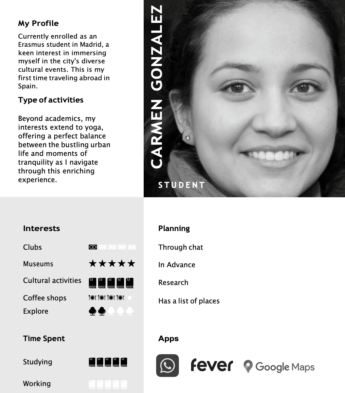
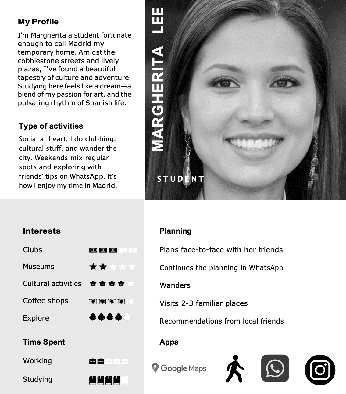
3.1 Personas Creation
After evaluating the differences between the physical, technological and social environments of our interviewees, 3 personas were crafted.

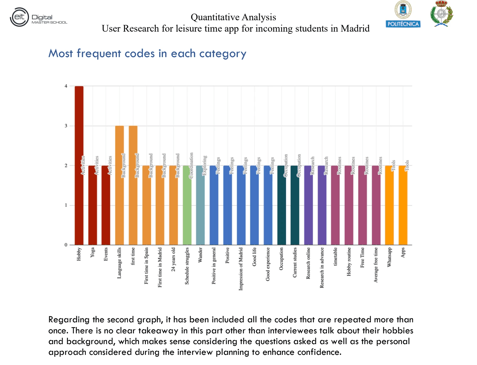
3.2. Quantitative and Qualitative Analysis
The results from the interviews were studied by doing individual coding and a consensus between the team of each interview done. This is an easy graph that summarizes the findings from these studies:

Validity of Results
To measure the validity of results obtained from the research, the whole process needed to be studied, reviewed and defended.
This was done after doing:
Data Source and Coder Triangulation
CoreQ Document
Fleiss Kapa
Inter and Intra Coder Agreement
If you want to know more contact me so I can share the specific results!
Designing the UI
After analyzing the data we wanted to create a mobile application.
Based on this we started creating a prototype.
Steps of the planning process: navigation map, scheme layouts, and sketches of the prototype.
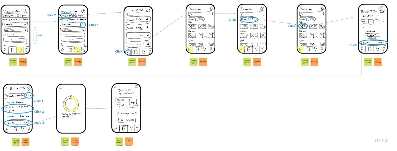
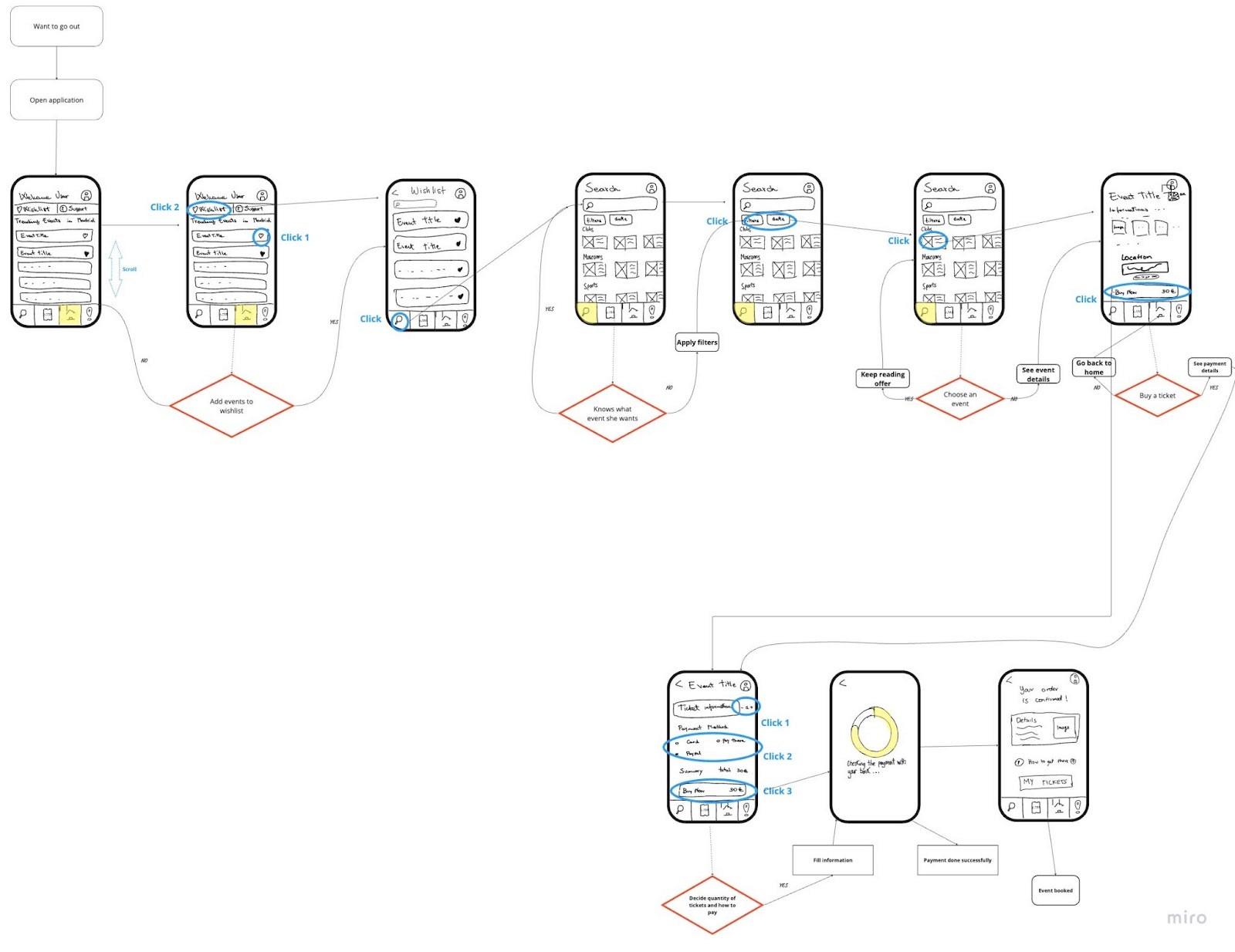
Before prototyping: Elaborated specific tasks for users' interaction with the system and showcased that with a wireflow.
5.1. Planning:
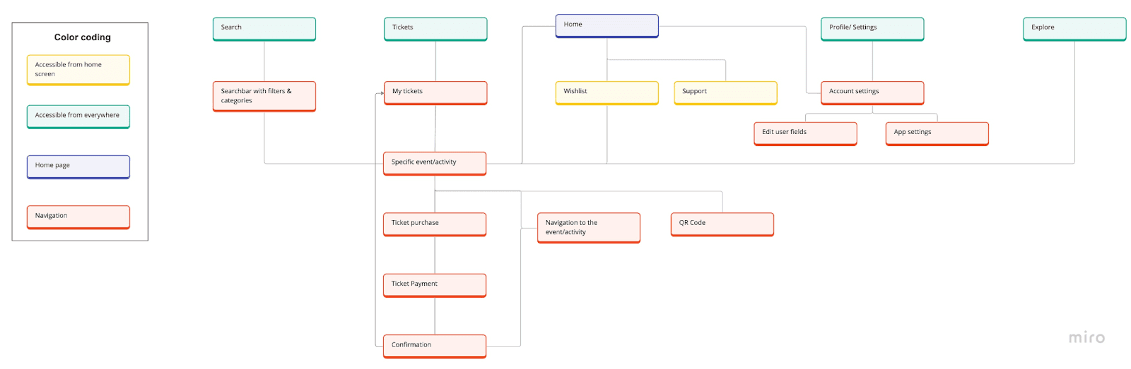
Navigation Map
Scheme Layout: 3 types of layout
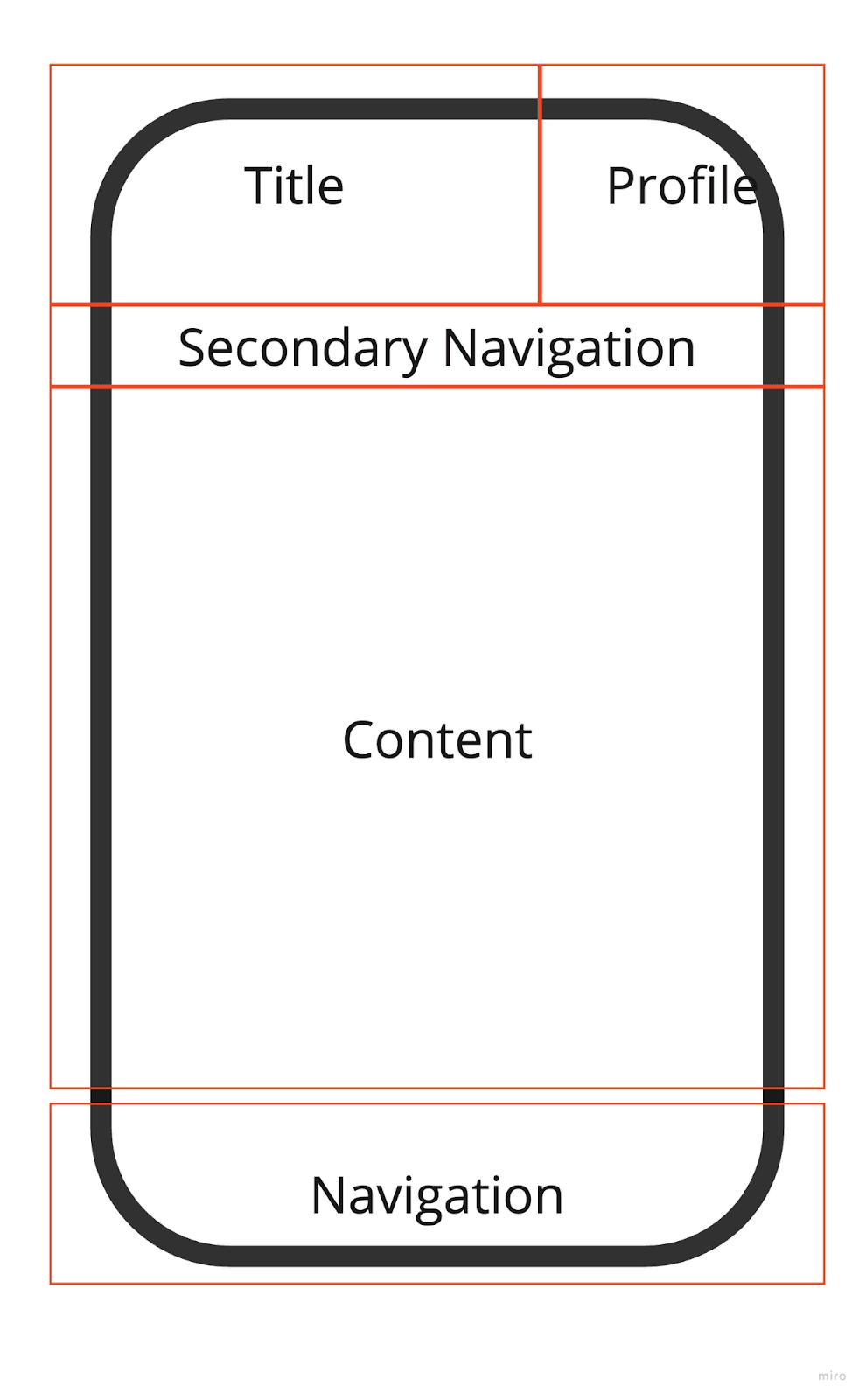
The first scheme layout is used for most of the start screens of one section. It is oriented on iOS design with a title on top and the main navigation bar at the bottom. We added the profile area next to the title, a secondary navigation for screen-specific navigation elements. The center of the screen is filled with screen-specific content.
Layout usage in: home, search, tickets, and explore.

The second scheme layout is a slight variation of the first screen. In the upper area on the left side of the profile and title, there is now a navigation area. In the sketches, this navigation area is mostly used for backward navigation.
Layout usage in: specific activity, ticket purchase, ticket confirmation, profile, navigation, wishlist, and support
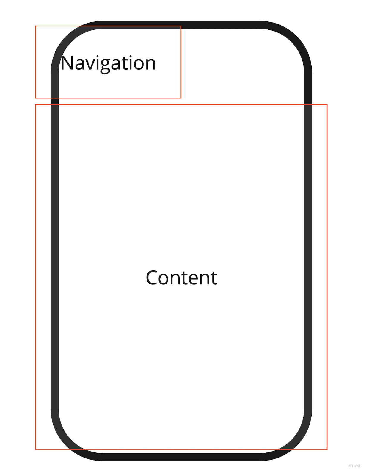
The third scheme layout consists of the content area which covers most of the screen. There is just one navigation area in the upper left part of the layout.
Layout usage in: ticket payment, user info, settings, and QR code.
Sketches
These sketches were done to have an idea of the screens and navigation flow to elaborate the first prototype.

5.2. Before Prototyping:
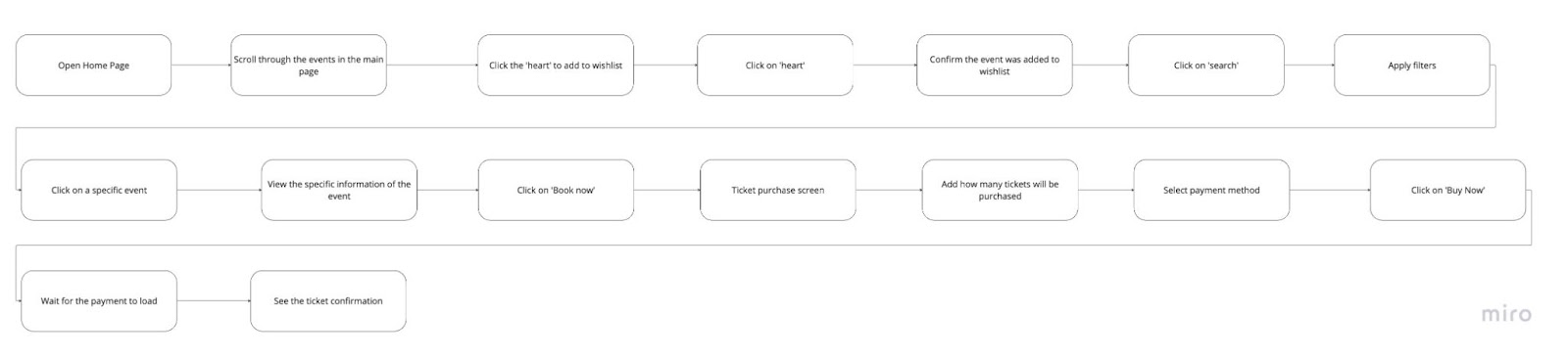
Task Flow
Wireflow
Extra: User Flow (to understand possible decision making)
Low-Fi Prototype
The elaboration of the paper prototype was a rapid process, where the goal was to find out if the UI of the app would work in different scenarios and to decide what to change before the Balsamiq elaboration.
6.1. Paper Prototype
See the complete prototype in use!
https://drive.google.com/file/d/16olsqT9kXKuMkvhL2nt4ffC4G5VwAeAq/view?usp=sharing
https://drive.google.com/file/d/1PJGr5wSE4u5Y2nFj6Z8rKJQE3lzARebt/view?usp=drive_link
6.2. Balsamiq
Check out the final screens showed on the sketches made in Balsamiq for a LoFi Prototype!
https://drive.google.com/file/d/1-08scBz1Q85wSCTOIK7K5BuHDqJv0vBJ/view?usp=drive_link

Leisure time app
Project Summary
Overview: This is a case study I did as a part of my Master's Degree at Universidad Politécnica de Madrid.
Role: UX Design, UX Research
Team: 4 HCID Master Students (🇲🇽🇪🇸🇮🇹🇩🇪)
Tool Kits: Miro, Balsamiq
Users: University International Students in Madrid.
Timeline: 4 Months. August 2023 - January 2024
Outcome: Achieved a low-fi prototype from a user centered design research.
1. Project Summary
2. User Centered Design Process
3. Interviews Planning and Formulation
3.1. Personas Creation 3.2.Quantitative and Qualitative Analysis
4. Validity of Results
5. Designing the UI
5.1. Planning (Navigation Map,Scheme Layouts, Sketches)
5.2. Before Prototyping (Task Flow, Wireflow, User Flow)
6. Low-Fidelity Prototype
6.1 Paper Prototype. 6.2. Balsamiq Prototype
2. User Centered Design Process
Source: ISO Standard 9241-11
3. Interviews Planning and Formulation
To get to know what the users wanted, we needed to understand the context of use, environment and the users that would be our target. After doing interviews with 10 international students, we found out that even though they are similar the goals they are looking for in their leisure time varies.
Conclusion: Their context of use is similar as their main similarity is that they are foreigners studying in Madrid, they each want to experience Madrid in different ways depending on their interests and seek ways to fulfill their own expectations from their new home.
3.1 Personas Creation
After evaluating the differences between the physical, technological and social environments of our interviewees, 3 personas were crafted.
3.2. Quantitative and Qualitative Analysis
The results from the interviews were studied by doing individual coding and a consensus between the team of each interview done. This is an easy graph that summarizes the findings from these studies:
Validity of Results
To measure the validity of results obtained from the research, the whole process needed to be studied, reviewed and defended.
This was done after doing:
Data Source and Coder Triangulation
CoreQ Document
Fleiss Kapa
Inter and Intra Coder Agreement
If you want to know more contact me so I can share the specific results!
Designing the UI
After analyzing the data we wanted to create a mobile application.
Based on this we started creating a prototype.
Steps of the planning process: navigation map, scheme layouts, and sketches of the prototype.
Before prototyping: Elaborated specific tasks for users' interaction with the system and showcased that with a wireflow.
5.1. Planning:
Navigation Map
Scheme Layout: 3 types of layout
The first scheme layout is used for most of the start screens of one section. It is oriented on iOS design with a title on top and the main navigation bar at the bottom. We added the profile area next to the title, a secondary navigation for screen-specific navigation elements. The center of the screen is filled with screen-specific content.
Layout usage in: home, search, tickets, and explore.
The second scheme layout is a slight variation of the first screen. In the upper area on the left side of the profile and title, there is now a navigation area. In the sketches, this navigation area is mostly used for backward navigation.
Layout usage in: specific activity, ticket purchase, ticket confirmation, profile, navigation, wishlist, and support
The third scheme layout consists of the content area which covers most of the screen. There is just one navigation area in the upper left part of the layout.
Layout usage in: ticket payment, user info, settings, and QR code.
Sketches
These sketches were done to have an idea of the screens and navigation flow to elaborate the first prototype.
5.2. Before Prototyping:
Task Flow
Wireflow
Extra: User Flow (to understand possible decision making)
Low-Fi Prototype
The elaboration of the paper prototype was a rapid process, where the goal was to find out if the UI of the app would work in different scenarios and to decide what to change before the Balsamiq elaboration.
6.1. Paper Prototype
See the complete prototype in use!
https://drive.google.com/file/d/16olsqT9kXKuMkvhL2nt4ffC4G5VwAeAq/view?usp=sharing
https://drive.google.com/file/d/1PJGr5wSE4u5Y2nFj6Z8rKJQE3lzARebt/view?usp=drive_link
6.2. Balsamiq
Check out the final screens showed on the sketches made in Balsamiq for a LoFi Prototype!
https://drive.google.com/file/d/1-08scBz1Q85wSCTOIK7K5BuHDqJv0vBJ/view?usp=drive_link