SitDown App

Overview: The goal for this project was to validate an idea for an app to launch in the Madrid market, through professional user testing and research with expected users for Sitdown.
My Role: UX Design, UX Research, Visual Design
Tool Kits: Figma, A/B Testing (Lyssna), Qualitative & Quantitative Research, React Front-end Development
Users: Students and Remote Workers that want to work outside of their house, and sit down somewhere for more than one hour
Outcome: Validated Sitdown interface design with users. Created a functional app with React.
2.Finding Our Users
2.1. Initial User Research 2.2. Research: Context Of Use 2.3. Crafting Personas 2.4. Learnings from Research
3. Testing the "Sitdown" Idea
3.1. Lo-fi Prototype 3.2. Prototype 1 : Requirements-focused 3.3. Prototype 2: Social-interaction
4. Finding the best approach…
5. Developing the selected prototype
5.1.Navigation Map 5.2. Needs of Users
6. My Biggest Learnings
The Problem
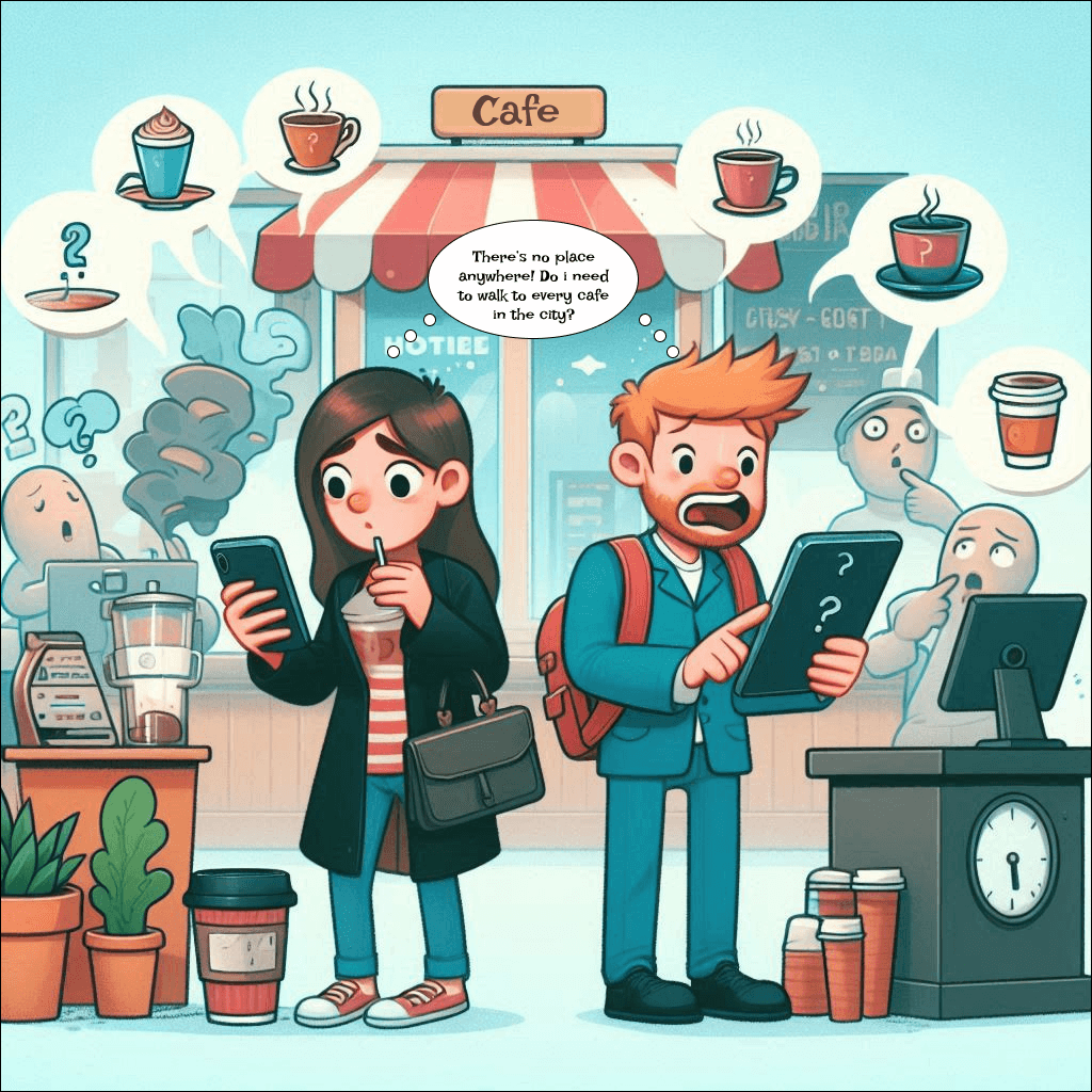
"I get lonely working remotely so I look for places outside my home where I can work multiple hours."
With the revolution of remote working and studying our meetings and way of connecting with others are online more and more but people don't always have space or want to get out of their home to feel productive or more social.
"I would love to study in cafés but I don't know where to find them."
In big cities like Madrid there is a café every corner but sometimes it is difficult to find where to go as there are laptop policies, entry fees, no wifi, wrong opening hours in Google Maps, no plugs or certain limitations that force you to be looking for hours a place where you can Sitdown.
Sitdown is an app that focuses on this problem by giving information about cafés where you can work, their amenities, places available, and a possibility to make a reservation for you and your friends.
Finding Our Users
2.1 Initial user research
Expected users are people who want a place to sit down and work on their computer, whether it’s working professionals or students; the users want a third place outside of the home to be able to do their tasks alone or in collaboration.
These users want to find a place with availability whenever they need it and have the confidence that they are not going to be wandering around wasting time looking for a place to sit down. Another type of users are the owners or managers of salad places as they need to add their business and update the real-time available spots each day.
Their abilities with ICT don’t require a deep knowledge of technology but it will require people who know how to use a smartphone, web, or digital services.
2.2 Research: Context Of Use
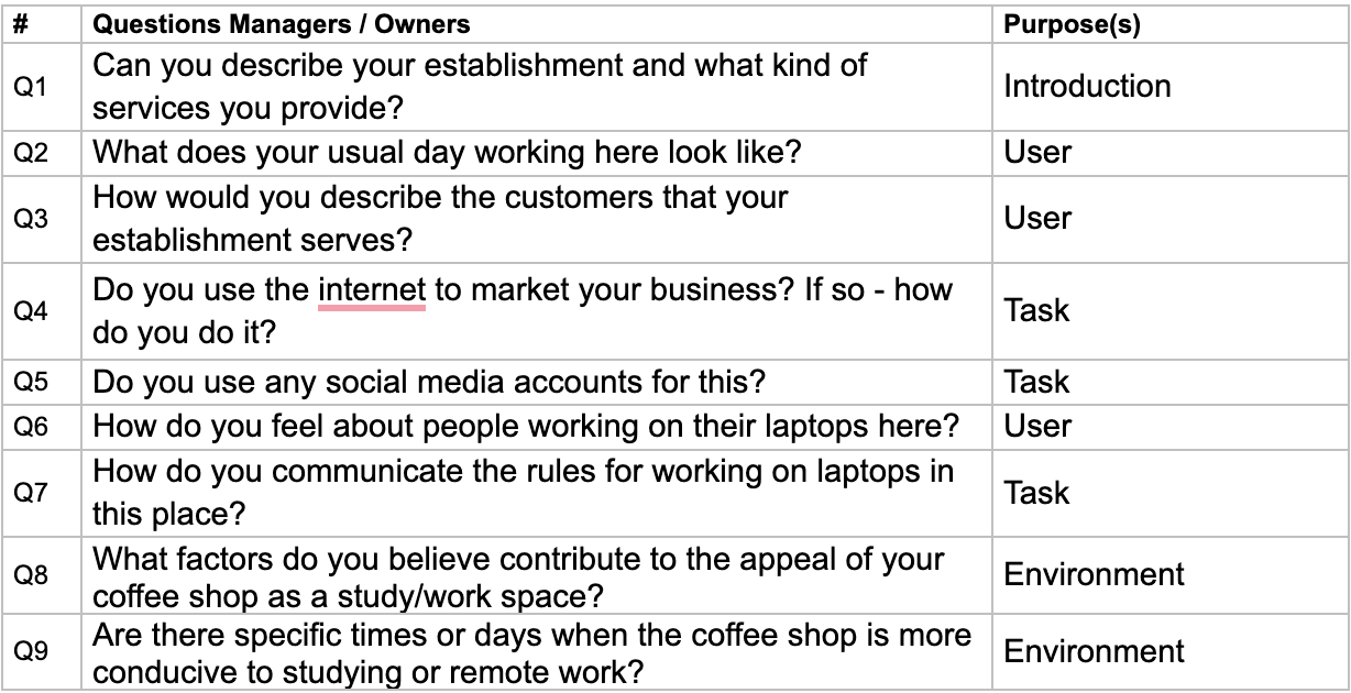
The facilitators job was to gather information in templates in EXCEL that were made beforehand for all:
Demographics
Questions for the students / managers interviews
Contextual inquiry
Ethnographic observation
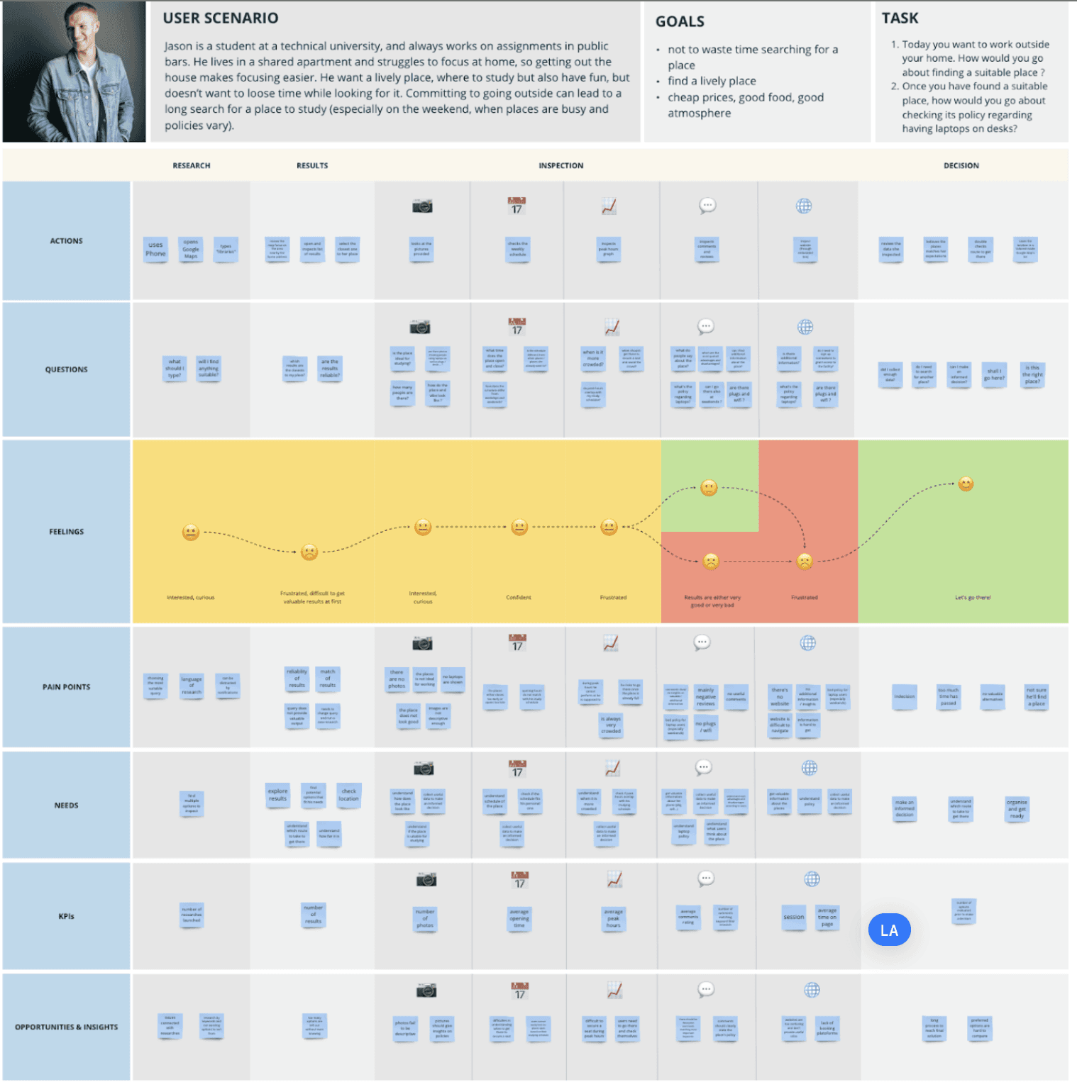
2.3 Crafting Personas
Crafting personas to decide what market we can target with the Sitdown App.
Who are actually the people that go to cafes or somewhere outside to work?

2.4 Learnings from Research
Overview: The prototype should be more precise with numbers, color contrast, and accessibility.
Personas: Good approach to target students and remote workers, but if we consider the manager we should include a task for them and this could be difficult for the testing (think of eliminating this task)
Task: What will happen after the reservation? people should be able to rate the place? So, leave a review?
Environment: More relation between cause and consequences in the operational risks. Physical environment → What happens when they are in the place? Maybe they can order food from app? maybe they can pre-order food so that at their arrival they already get the drinks and food?
Journey map: Attention to color
General scope: There is a need to get deeper in the task and environment in-place and after leaving it.
How does a student/remote worker make a choice?
Will he/she leave a review? or if he/she likes the place will he/she keep it a secret to him/herself?
What can people do with our system when in-place?
Order food & drinks? What else?
How can we motivate them to interact with the app more than once?
Testing The "Sitdown" Idea
3.1 Lo-fi Prototype
From the findings of the interviews made, we decided to do an A/B Test,
What does an A/B test mean?
=
Test 2 different designs for the same thing to choose the right path for users
Prototypes design was done in Figma and then printed in paper.
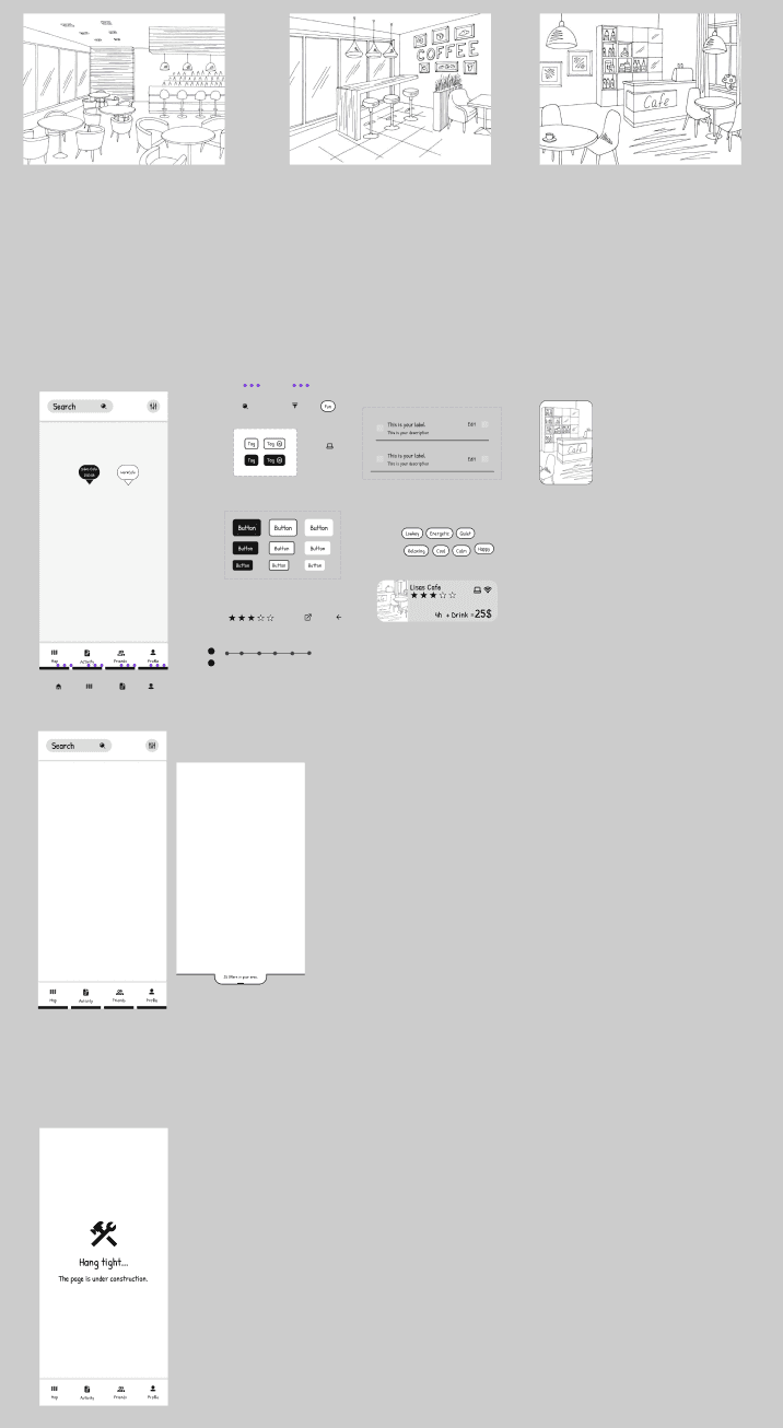
Click here to watch both prototypes:
3.2 Prototype 1 - Requirements-focused
The requirements-focused prototype uses “Offers” that Coffee shop managers create to attract more customers who are willing to pay for premium services. While managers are users of the app too, we only prototype the interactions of their customers in this iteration. The offers are displayed on a map. The offers can be searched and filtered. When an offer is selected an overlay appears, that allows specification of time for the reservation and number of guests to be reserved for. To find out more about the establishment users can visit its profile. Once an offer is confirmed by the user they will be redirected to the activities view, where they can see and manage their reservations.
3.3 Prototype 2 - Social Interaction
The social interaction prototype is based on the interaction between users and places as well as users between users. Users have access to a customised feed showcasing places their friends recommend and interact / have interacted with. For each action, social interaction features are highlighted, always always aiming to help users reach their goals. This approach is the biggest difference with the requirements-focused prototype: his prototype implements a design that aims to reproduce the social interactions that guide users in the process of choosing a place to study.
In both prototypes users can research according to personal requirements; in the second prototype, though, highlighted results are those linked to friends’ network. Another notable difference lies in the requirements: these are based and rated on users’ evaluations (e.g. the level of productivity of a place is defined by all those users who considered and rated the place as productive). This is another example of how we always manage to keep the social interaction behaviour.
Finding the best approach…
Users were given the following 3 tasks in order to see what approach they understood better and was more comfortable for them.
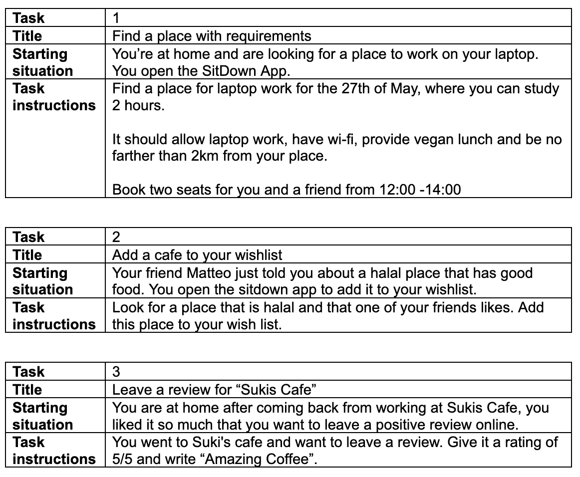
The goal of the testing was to evaluate how the two designs fit the mental models of the participants. The evaluation has been made using the “thinking aloud” method.
Evaluated attributes: efficiency, effectiveness, and user satisfaction for both prototypes.
The prototype with less mistakes done by the users was Prototype 1: Requirements-focused prototype.
Why? ————> More intuitive and the problem that people didn't spot the filter was easily fixable.
The map view aligned with the users goal of navigating to find a location and they experienced it as simple to use.
SUS score: 84,1
The second prototype encountered a lot of confusion within the testers as there was a lot to see and the information was difficult to find intuitively.
SUS score: 58,1
Users seek a balance between functional work requirements and a comfortable, engaging social environment.
Developing the selected prototype
After the Lo-fi iteration, we quickly started to program in React a high-fidelity prototype as we had 1 month to finish it and test it with real users that would give us feedback on it.
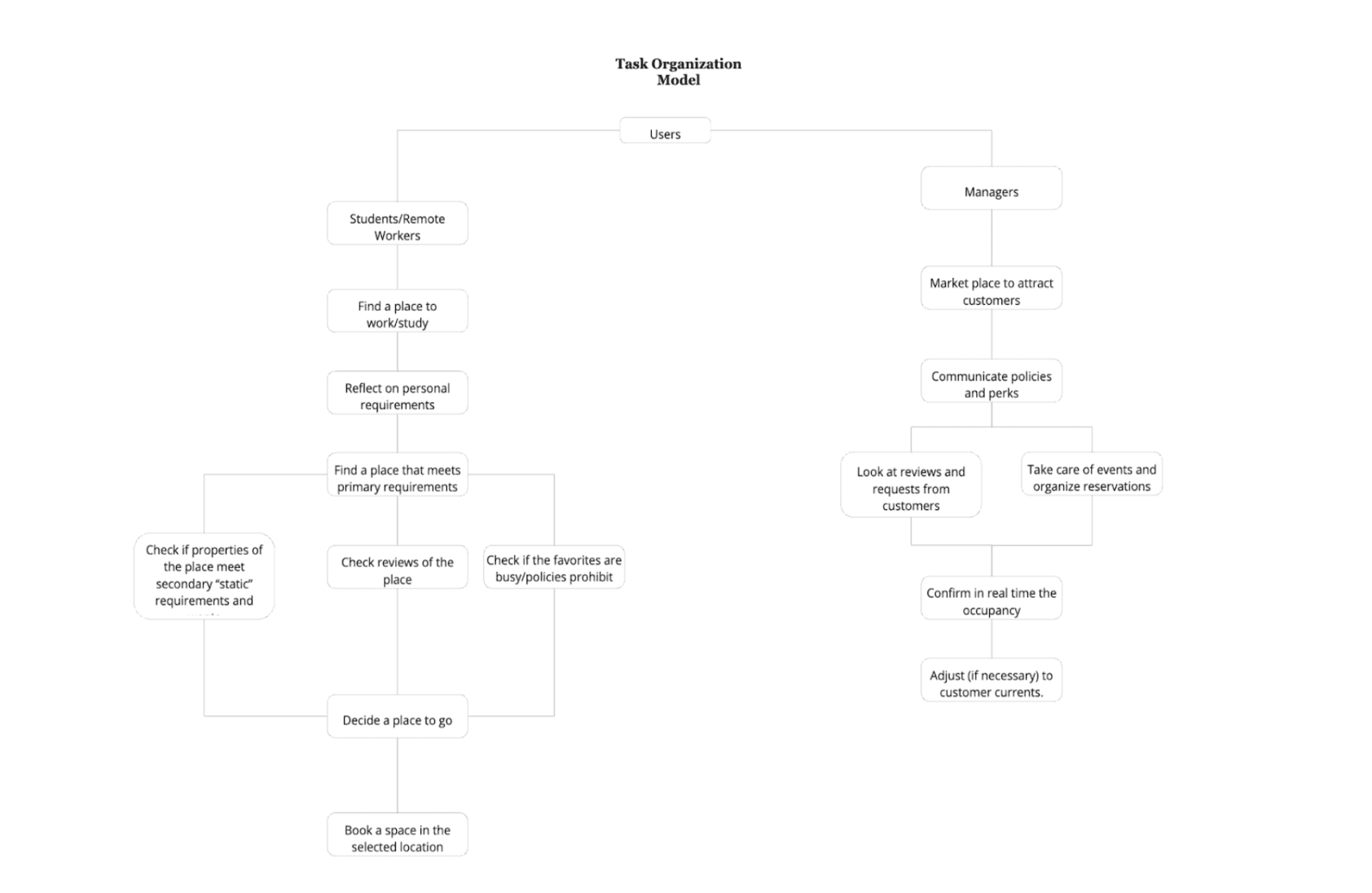
5.1 Navigation Map
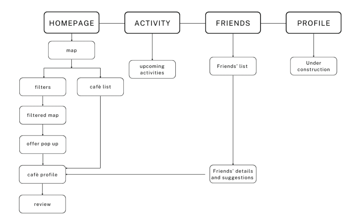
5.2 Needs of users
Need 1: For users it is essential to have somewhere to be able to look for the offer of places.
Need 2: Users need to know what each place offers and their policies.
Need 3: Users want to know other people’s opinion to be sure of what they are choosing.
The team was divided with different tasks as we had a timeline to achieve. I was responsible to develop specifically the "Filters", "Filtered Map", "Offer Pop-up" sections and help the rest of the team with any questions or problems that may arise.
A high fidelity prototype was achieved, watch the following video to see the results.
Check out the github repository and the apk for the app!
My biggest learnings
Working on a project as big as needs a lot of organization and trust in the rest of your team, as everyone has a role and when someone doesn't fulfill their tasks it might be because they need help. -> Communication every week is key.
Product development is an iterative process and you have to be flexible with what you are creating because the users might want or need different things than what you thought. -> Be flexible!
Having the users' feedback throughout all the development was key in focusing on the right problems. -> Have a user-centered design.